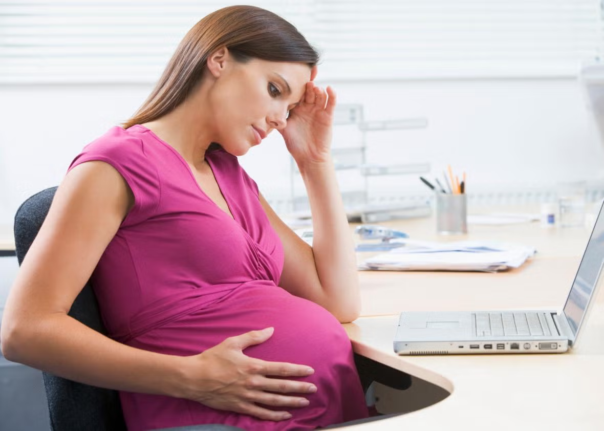
Spec Wreck

Why is it so difficult to build to spec? (Just to be clear, I’m referring to all design fields, not just the software industry.)
Is compromise just an inherent part of the process? How detailed do our specs really need to be? Lately, my specs have become pretty lean. This seems to work well on a small scale because additional verbal communication adequately bridges any gaps, but what about on a larger scale when verbal communication might not be an option (due to different time zones, etc.)? Is creating detailed specs, only to have to compromise during development, really the best way to go?

sexy: (adj) marked by or tending to arouse sexual desire or interest

I have never seen or used a software application that in and of itself aroused my sexual desire. Combo boxes, regardless of how nicely they are done, are not sexy. Fancy charts and graphs do not turn me on. And I can assure you I have never fantasized about buttons (regardless of how big they are).

So those of you in marketing, please stop asking me to make software applications sexy! I can’t.

It’s true, some products are thought of as sexy. They may exhibit visual cues that resemble those of humans, they may have some relationship to sex itself, they may satisfy a particular fetish, or they may be associated with power and wealth. It’s not completely unreasonable to deem these products “sexy”.

But, Facebook is not sexy. Google is not sexy. Enterprise software? Not sexy. Beautiful, well designed, exciting, fun to use, yes. Sexy no.

Trend: SVG use on the rise


Software can be like wine.  Let’s say, a bottle of red wine. How about, a Cabernet Sauvignon, aged 11 years or so, that you forgot about in your wine cellar.  You’ve tried this one before, when it was still young, and it didn’t do much for you.  Now you give it another shot…

You immediately notice hints of oak, vanilla, and traces of blackberries.  It’s a little much to take in, so you let it breathe.  You then notice rich tannins, and more complex aromas that you can’t place.  You look at the bottle, and read label: “Scalable Vector Graphics ~ 1999″.

The Scalable Vector Graphics (SVG) format is nothing new.  Created around 1999, this XML based standard needed to mature a little to really show it’s capabilities.  I’m sure those of you that have been around these interwebs a time or two have come across SVG in the past and were probably unimpressed.  With the web becoming a legitimate platform, and as the underlying technologies (HTML, CSS, and Javascript) and the browser have finally started to mature, the capabilities of SVG can now be realized.  We all know from the mass amount of shiny icons and “web 2.0″ sites out there that vector graphics are really popular these days.  But with SVG, the ability to use and manipulate vector graphics as objects is taking the web past 3.0, all the way to 4.0!!

Here are some examples of pretty compelling uses of the SVG format:

The Raphaël Javascript + SVG Library
http://raphaeljs.com/analytics.html
http://raphaeljs.com/chart.html
http://raphaeljs.com/ball.html

W3C Example w/ Code:
http://www.w3schools.com/svg/tryit.asp?filename=animatemotion_2&type=svg

One of the more famous SVG examples, the cubic spline tiger:
http://www.croczilla.com/bits_and_pieces/svg/samples/tiger/tiger.svg

“What about HTML5?” you might ask.  ”What about the really cool stuff that the Canvas tag can do?”  Well, there is some overlap, but SVG is much more suited to manipulating objects than the Canvas.   The way to view it is that (out of the box) SVG deals with graphical objects (vector graphics, raster graphics, text) and remembers what is rendered, making it easy to re-render.  The HTML5 Canvas is a lower level protocol that is basically a “drawable” region, which makes it very flexible.  One is not better than the other, they are just different mechanisms.  If SVG is a bottle of fine wine, the Canvas is a Cuban cigar.

Trend: Changing UI Interactions


The touch screen has changed the way we think of interacting with ui’s (its also changed how we drive – admit it, it is WAY harder to text while driving and I am convinced that it has brought about or at least sped up texting while driving laws). So how will our computer and device interactions change next? Or will they. Here are a few interesting sites. Feel free to share more!

About 7 months ago I got the bright idea to renovate the master bathroom in my house, granted I have almost zero handyman skills, a full time job, and contract work that keeps me busy so I’m not sure how or why I thought this would be a good idea. It was a terrible one – shame on you HG channel. So fast forward to today and I’m still not done and at this point I’ve come up with every excuse in the book to avoid working on this project, just like I always seem to come up with a good excuse to avoid redesigning my own website. For instance, writing a top 10 list is a good way to avoid both…

In the spirit of excuses here are the top 10 reasons redesigning your website is like renovating your bathroom.

10. Both require removing rotten frames (if you find any)
9. Both might require hiring a professional
8. Both seem to go on forever
7. Both require the right tools to get the job done
6. Both involve uncovering disturbing things from the past
5. Both should follow industry standards
4. Both require preliminary planning to be successful
3. Both have fantastic online resources
2. Both have designs that at one point were in style but now I can’t stand
1. Both involve meeting objectives or you could really land in hot water

BIXI!

BIXI is a bike-share program in Montreal, QC. The system was fun and easy to use, as well as relatively inexpensive. The entire experience, from using the kiosk, to adjusting the one-size-fits-all bikes, to locating another bike rack after reaching our destination, was pretty simple. Check it out:

http://montreal.bixi.com/home

Kyla with iPhone

Okay, so maybe it’s not that surprising that my 4 year old figured this out. Our kids are so much smarter than us. But still…

The other morning I woke up around 5am with a sense that something was awry. I immediately noticed that the hall light was on so I investigated and also discovered the light to my 2 year old’s bedroom had been turned on. I quickly turned it off hoping she wouldn’t wake up when I heard a faint noise from my 4 year old’s room. There was Kyla, lying on her bed with my iPad propped up in her lap. When she saw me she proudly exclaimed “Dad, look what I found! I’m watching Monster’s Inc.” She was streaming Monsters, Inc. from Netflix!

Monsters Inc

Now, the interesting part: Kyla had never used my iPad, nor had she ever watched me use my iPad except to read her a book (twice). Retracing Kyla’s steps demonstrates several hurdles she overcame, and some that I may not even be aware of:

  1. 1. She found the iPad
  2. 2. She opened the cover and turned it on. No big deal here – she regularly uses and plays with an iPhone, so she does have that experience to leverage
  3. 3. She selected the Netflix icon
  4. 4. She browsed Netflix and somehow found Monster’s, Inc. It was NOT in my Instant queue. I don’t want to consider what she might have seen while browsing Netflix…
  5. 5. She figured out how to begin playing Monsters, Inc. Remember – she can’t read.


All in all a fairly arduous task for a 4 year old, yet Kyla seemed completely relaxed and quite proud of herself when I found her. I let her enjoy the rest of the movie and got in bed next to her.

Looks like Apple and Netflix both have passed the 4 year old “ease of use” test! And now I know where various mysterious charges may be coming

Banner Ad 2.0?

I think most of us have fallen into this trap. You browse to one of your favorite sites on Monday morning, mindlessly trying to look busy without doing any actual work. You hit Youtube or ESPN.com and just as you click the link you’re looking for, the screen shifts around and you’re whisked away to a world of new cars, video games, and male enhancement pills.

What you clicked was not what you expected.  It was the new “improved” banner ad; complete with a new twist – the classic bait and switch.  These colorful page headers usually have an embedded video, and usually expand when the user hovers.  The result is that the main navigation and content is, in most cases, either completely covered or pushed down.  And for those quick-clickers like myself, before you know it, you’ve been thrown into some company’s ad revenue stream… without a paddle.

So is this clever a clever mix of advertising and technology, or simply the new and improved popup: impervious to the “browser block”, and capable of intercepting the clicks of unsuspecting users??

Greetings ladies and gentlemen and Russ, I’ve just started working on the 7th edition of HTML, XHTML & CSS For Dummies and yes, before you say it, Wiley publishing picked the perfect “dummy” for the job (insert sitcom laugh track here – har, har, har).  Anyway, I’ve created a new Twitter account for the upcoming version of the book and we are going to list the first 1,000 followers as supporters. Why? Why not! That’s why. So if you are interested in web design, HTML, XHTML, CSS or you just really enjoy seeing your name printed in a book, all you need to do is follow this Twitter account:

http://twitter.com/dummieshtml

That’s it. Enjoy!

janine-dvdMega super author/speaker/web designer/teacher Janine Warner has provided us a copy of her “Total Training for Adobe Dreamweaver CS4: Essentials” DVD that we are giving away for free (Almost a $100 value) for one lucky winner!  But wait, it gets better!!!!  The winner also gets a site review from Janine with suggestions on improving an existing web site or how best to create a new one. Learn more about Janine Warner here.

All you need to do to be eligible win this DVD is to leave a comment on this post by June 16, 2010 and answer the following question.

How would you like to improve your Web site?

Comments are now closed, congratulations to our winner Scottsc!

Page 1 of 111234510...Last »